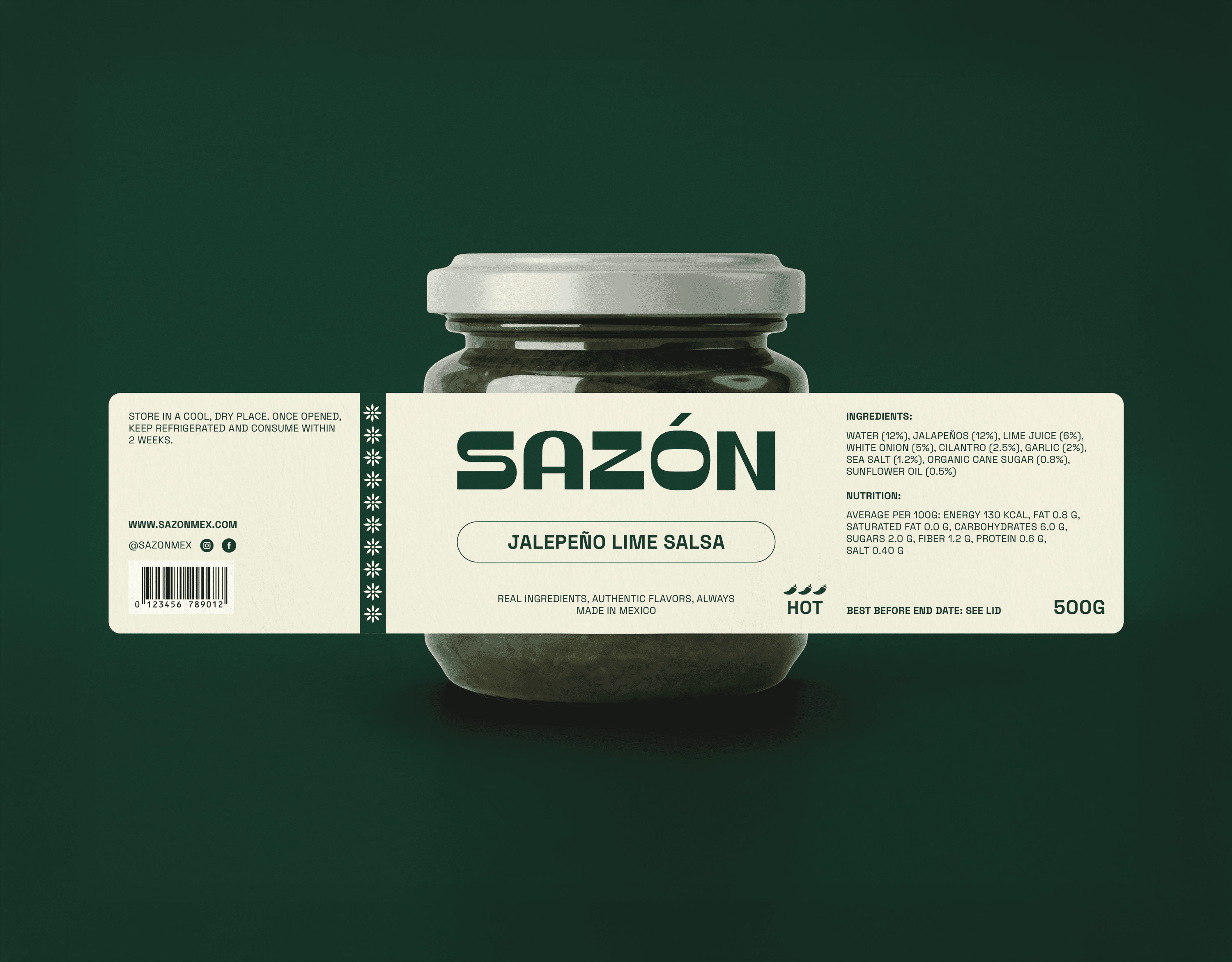
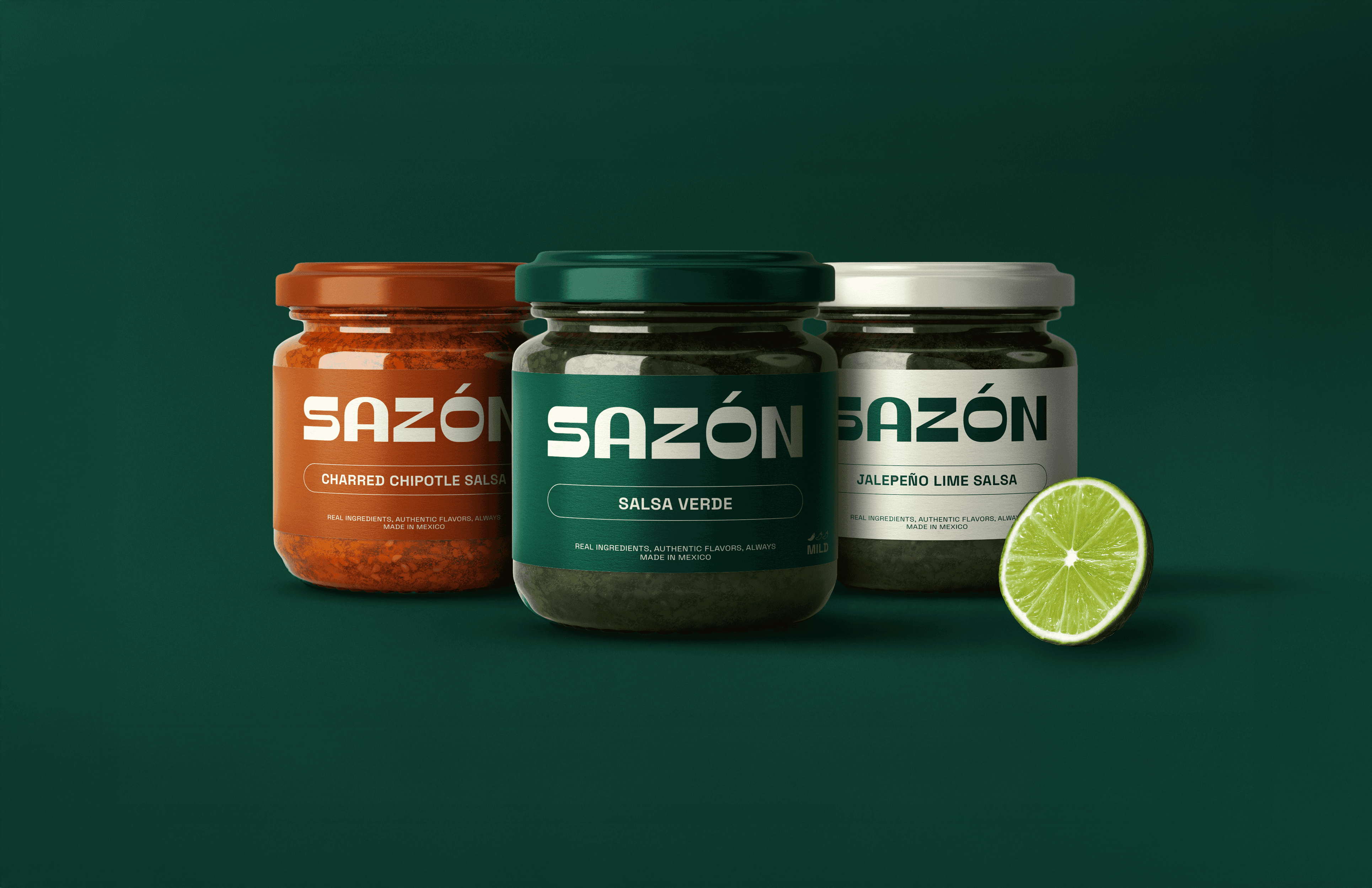
Sazón began as a response to the visual noise commonly seen in the salsa aisle. A category full of bold flavours but packaged in the same clichés like flames, mascots, and crowded labels that make choosing harder than it should be. I wanted to imagine something quieter, clearer, and more confident. This concept explores a modern, flavour-first identity built on bold colour, simple hierarchy, and an intuitive heat scale. No gimmicks, no clutter, just a system that lets each salsa speak for itself. The result is a calm, contemporary brand that stands out by not shouting and brings clarity and character to a familiar product.
Role:
Lead Designer
Project Type:
Visual Identity, Packaging
Industry:
Food
Year:
2025